When a hypercar brand learns to whisper

An exterior design of translating extreme performance DNA into Apollo’s first electric luxury sedan.

Out of respect for my non-disclosure agreements with IDEENION and Apollo, certain technical and commercial details aren’t shared here. Everything else is my own honest account of the work.

A different kind of Apollo

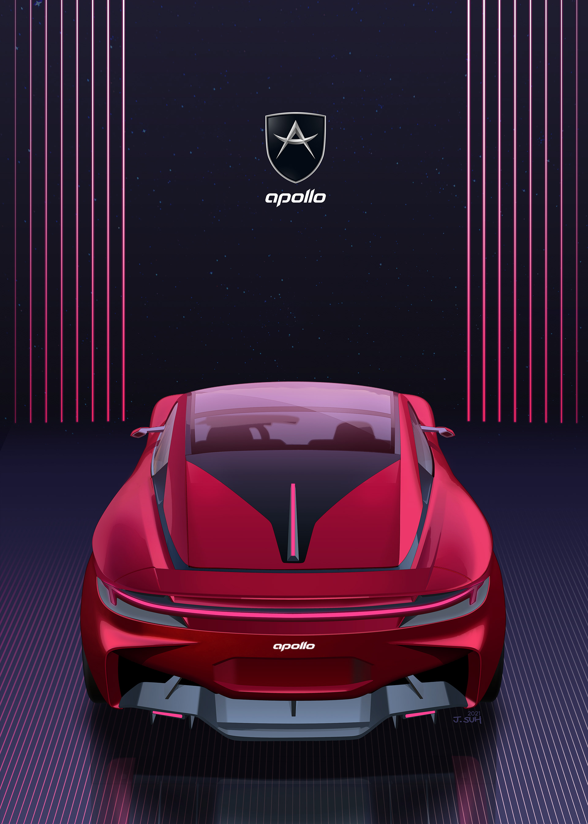
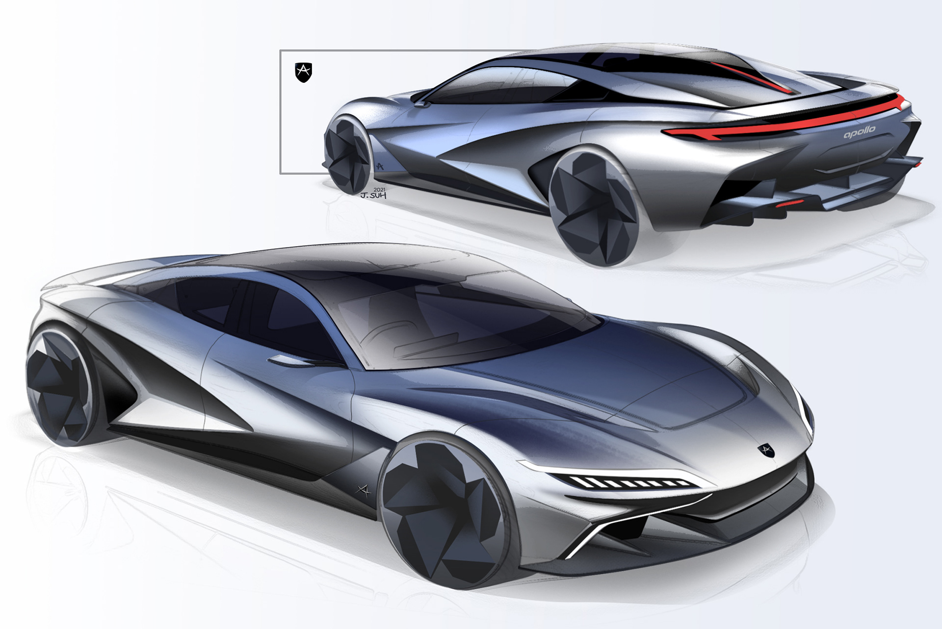
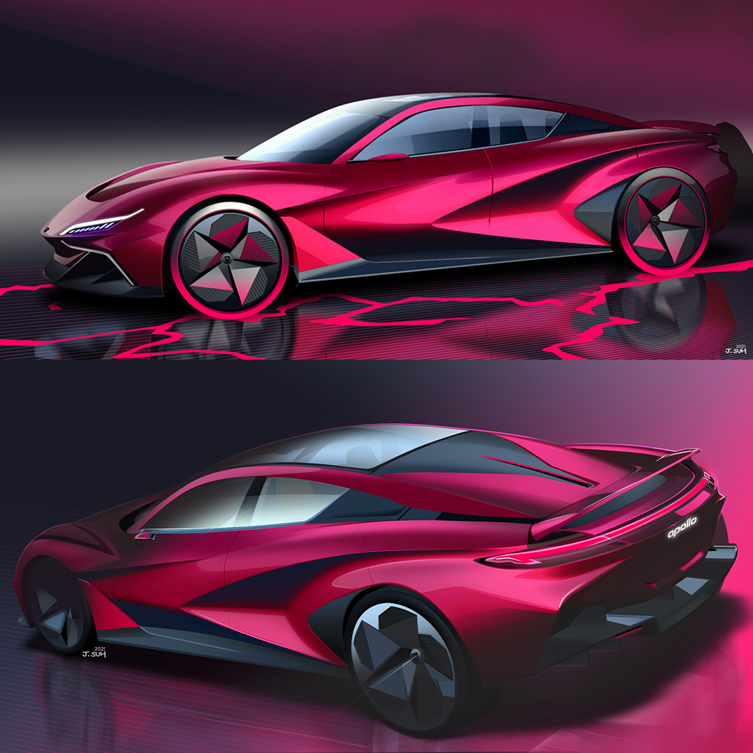
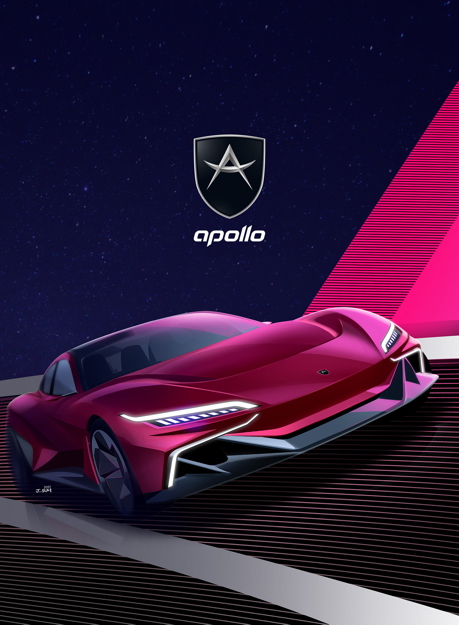
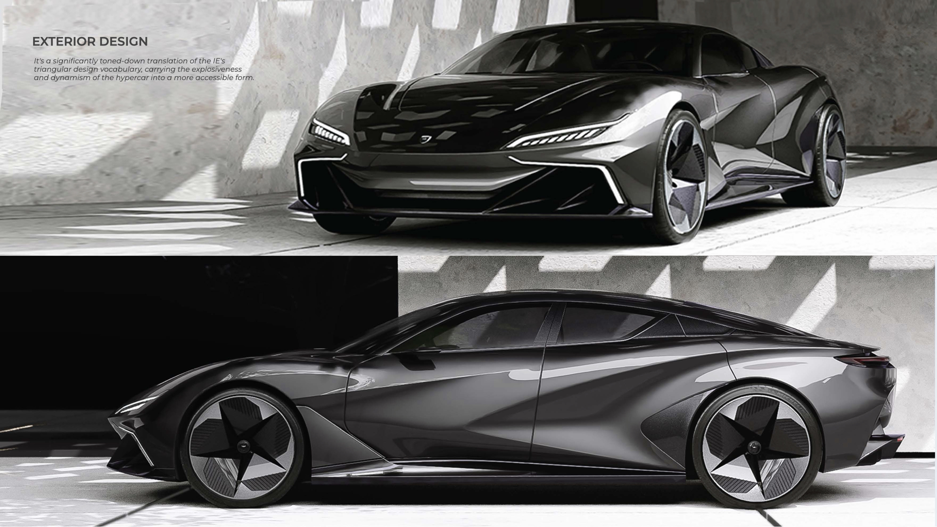
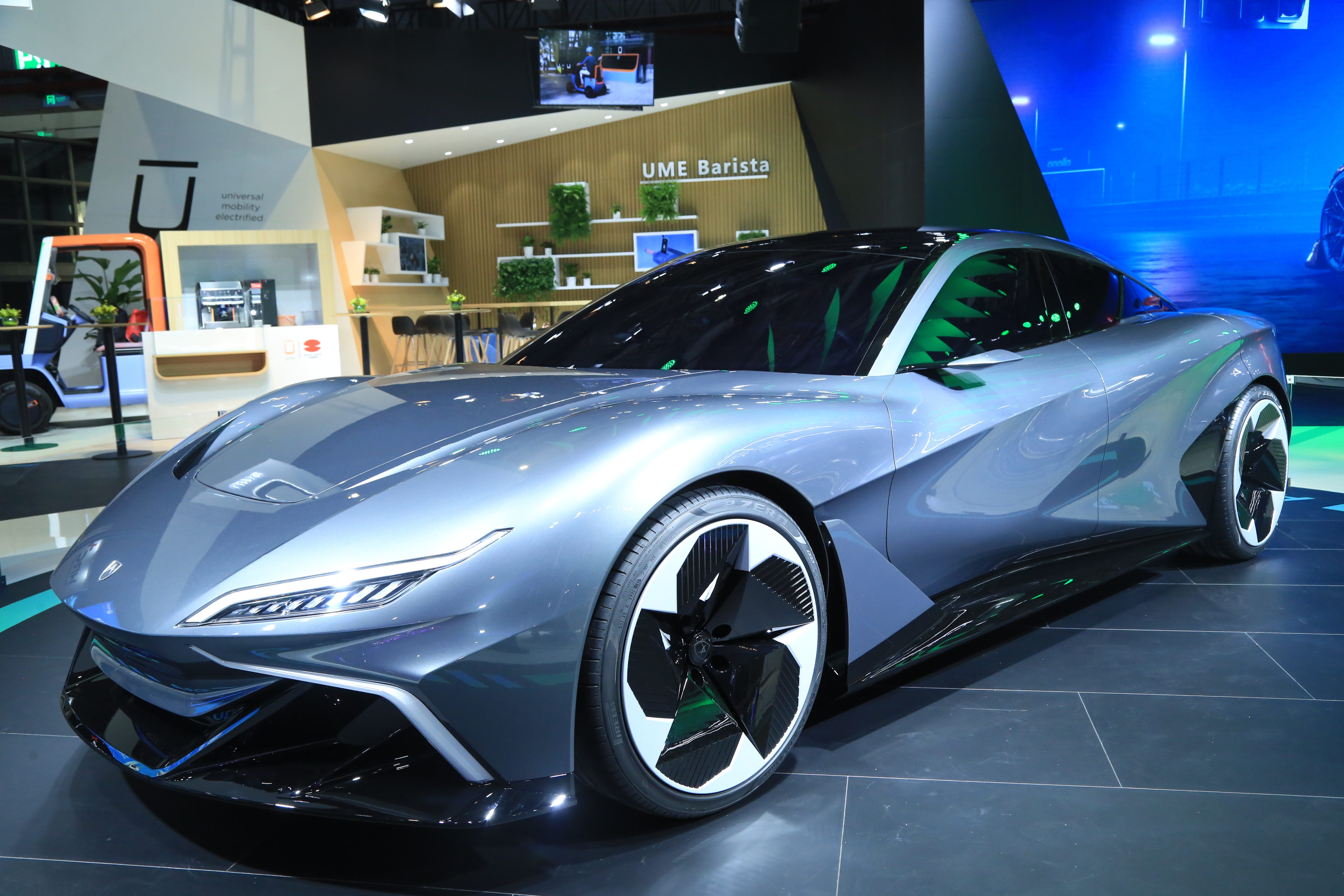
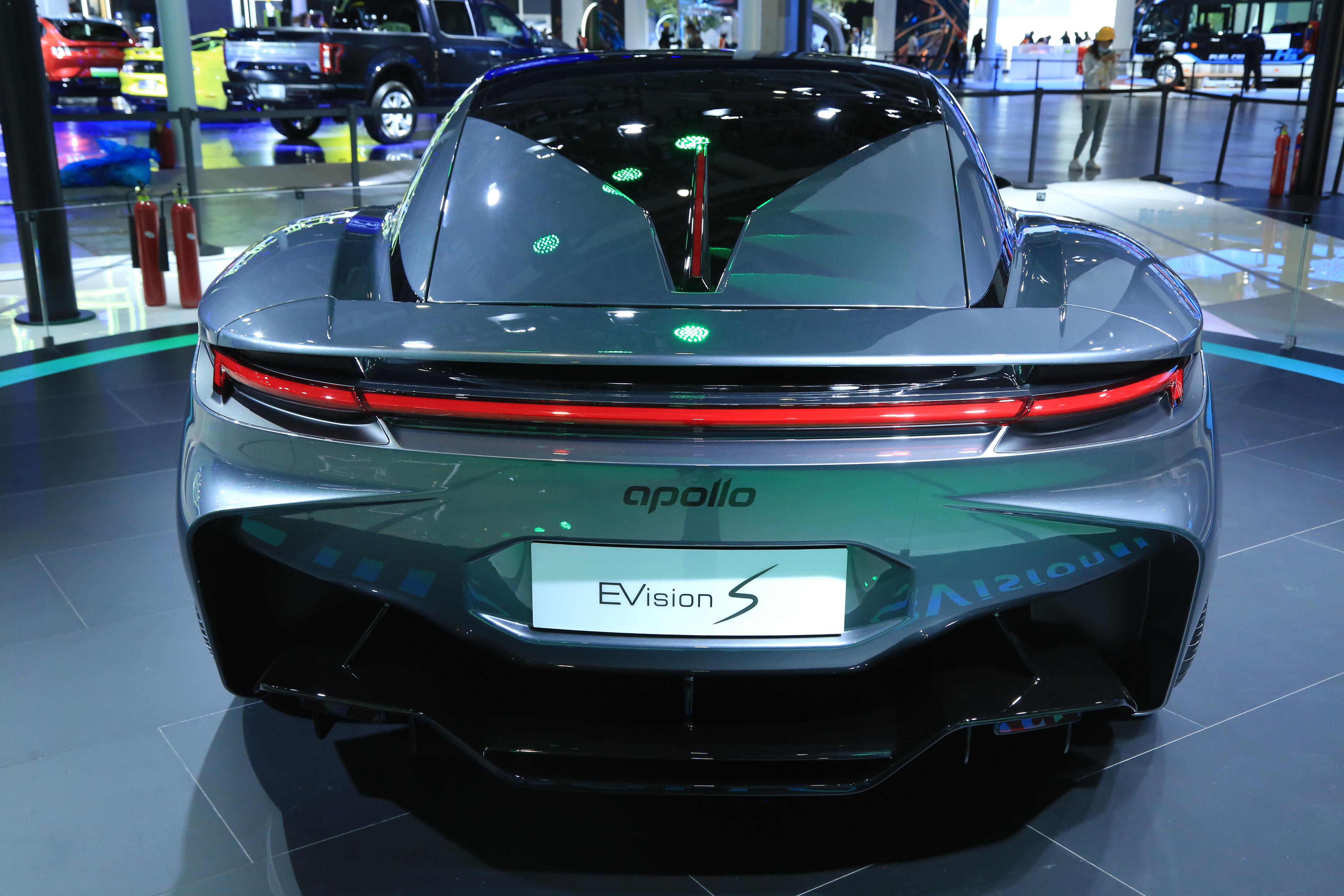
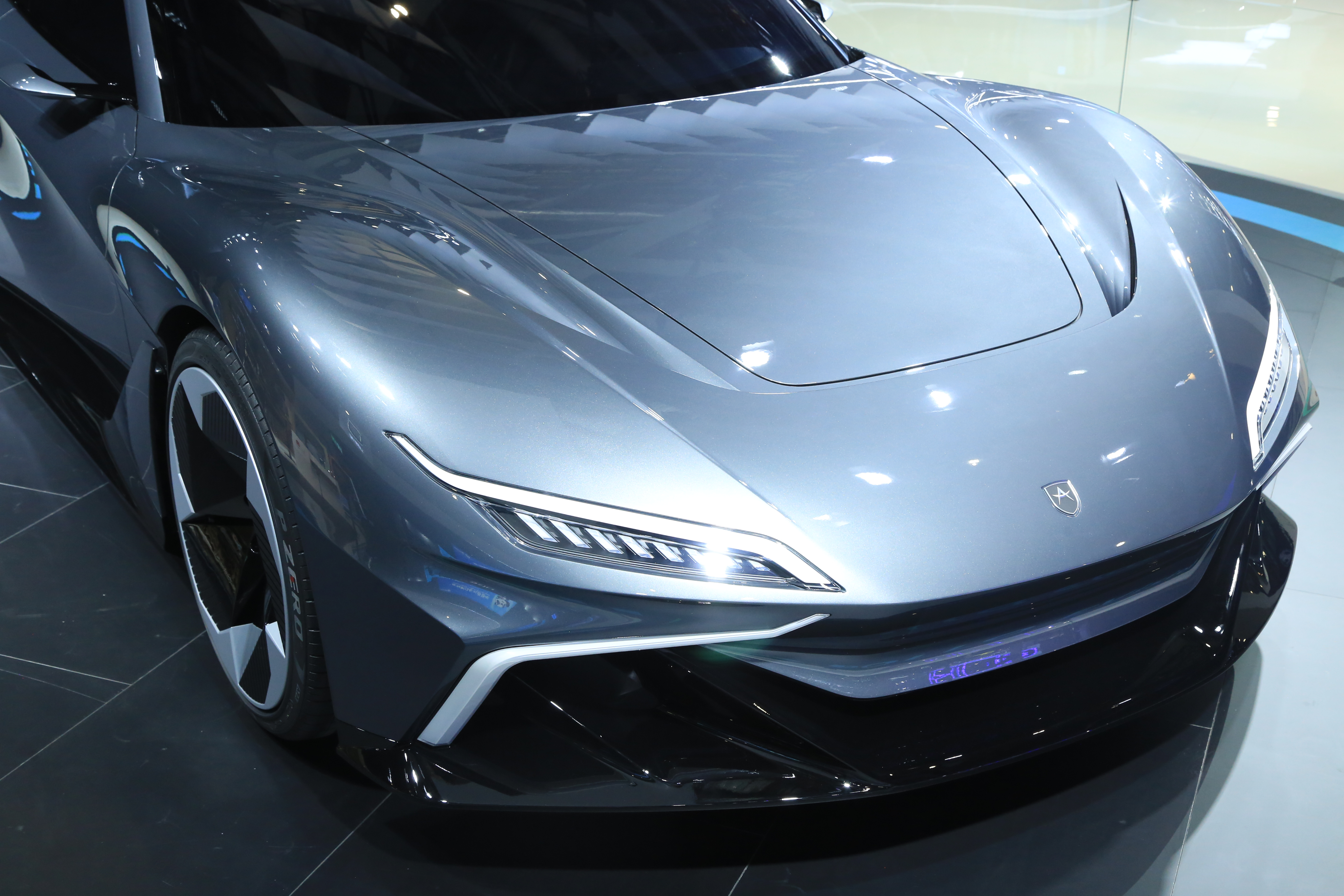
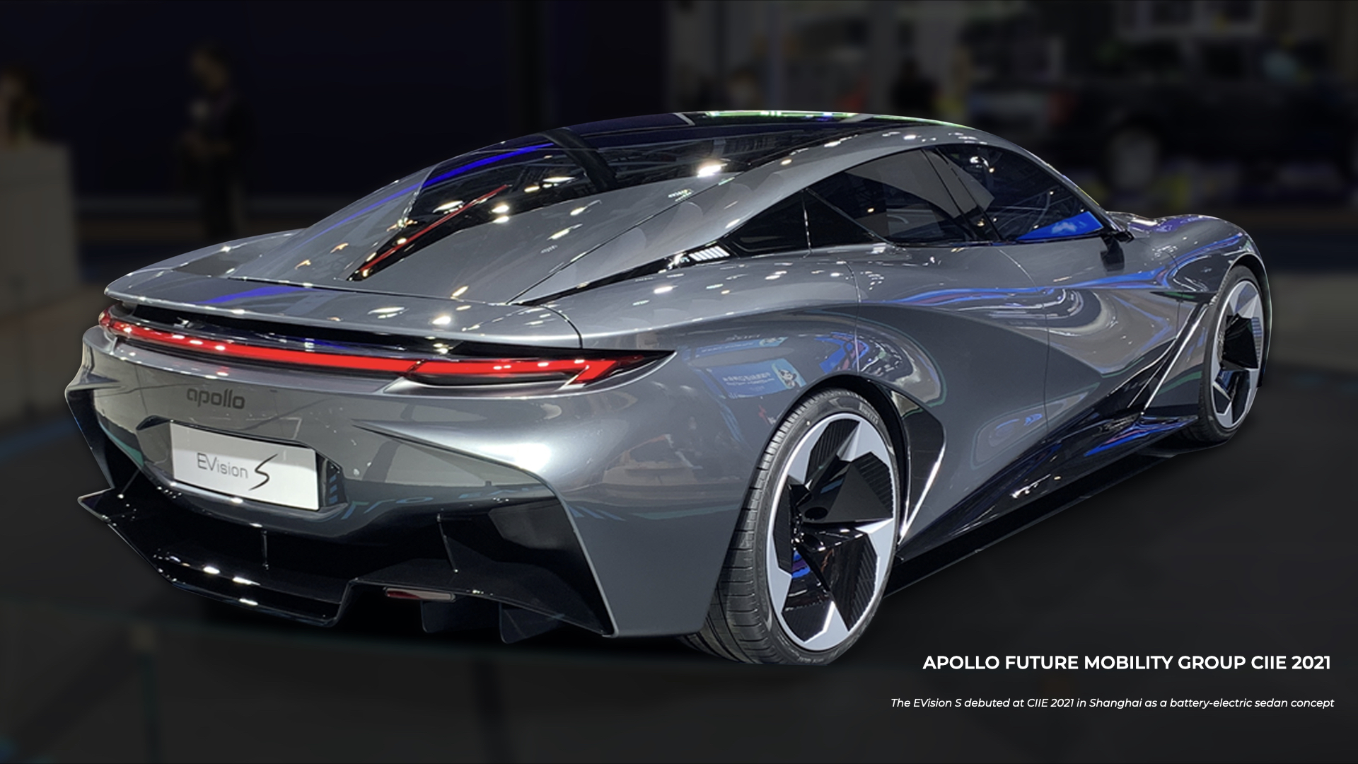
Apollo Automobil was built on extremes. The Intensa Emozione, a naturally aspirated V12 track car producing 780 hp, defined the brand’s visual and emotional identity: exposed carbon, aggressive surfaces, nothing soft, nothing unnecessary. That language works precisely because it makes no compromises.

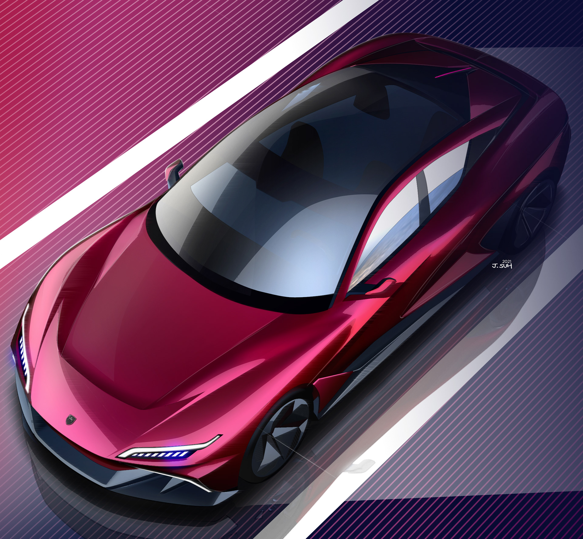
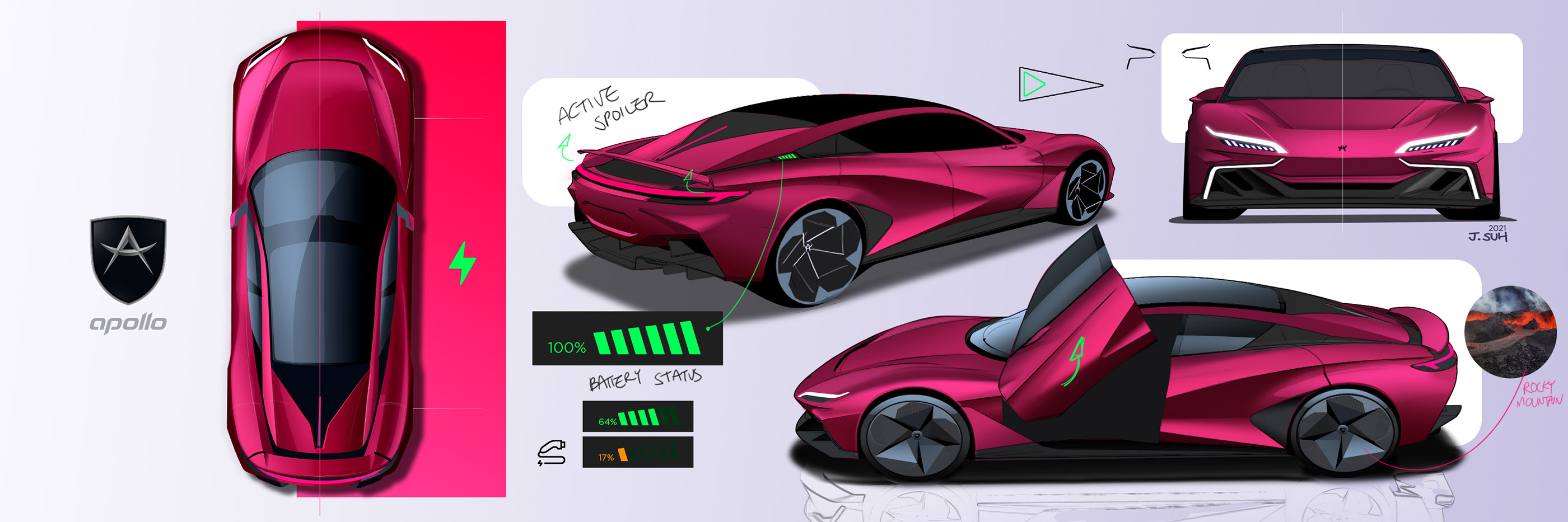
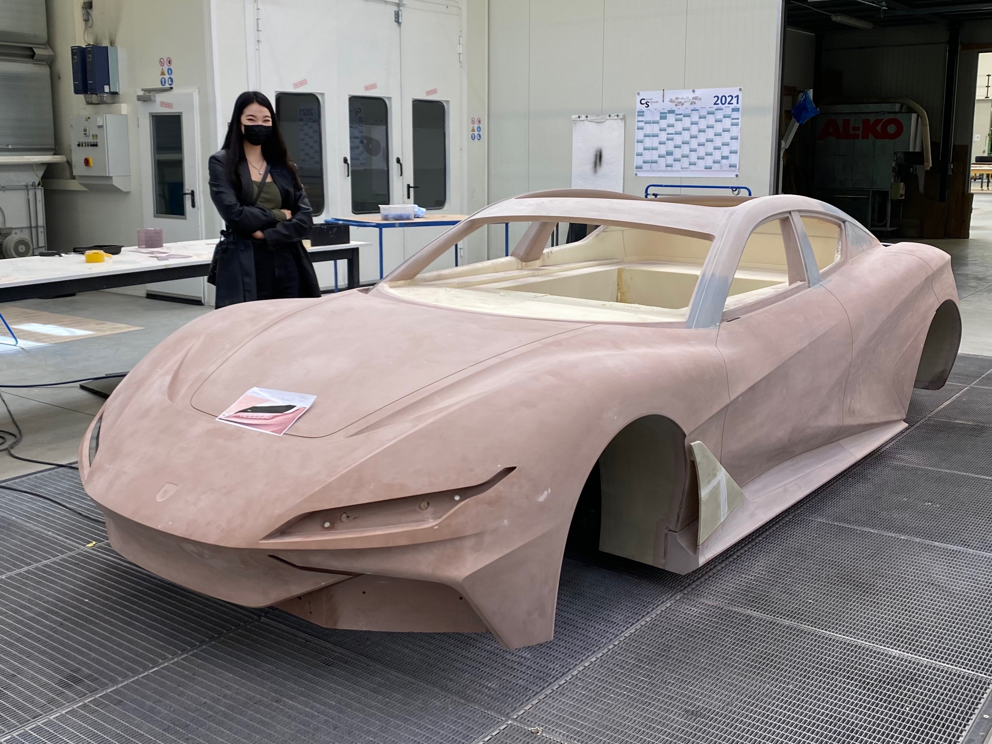
The EVision S asked for a compromise. Not a weakness, but a different kind of strength. Apollo’s first electric luxury sedan had to carry the brand’s DNA into a segment it had never entered, a daily-driven, road-legal, refined vehicle for a global luxury market. The question was whether a car that needed to feel approachable could still feel unmistakably like Apollo.

A brand at an inflection point

The luxury electric sedan market in 2021 was accelerating fast, with established players and new entrants competing on technology, range, and design language simultaneously. For a brand like Apollo, entering that space carried a specific risk: dilution. The visual aggression that makes the IE iconic would read as excess in a sedan. But abandon it entirely and the car becomes just another luxury EV with no story to tell.

The EVision S needed to find a third position. Not a softened hypercar. Not a luxury sedan wearing Apollo badges. Something that could hold both identities at once, on the same surface, at the same time, and debut at the China International Import Expo in Shanghai as Apollo’s statement of intent for the world’s largest electric vehicle market.

Apollo EVision S concept render

The Challenge

Power and refinement on the same surface at the same time. Hypercar proportions carry aggression through wide stances, compressed greenhouses, and surfaces under tension. Luxury sedan proportions carry confidence through longer wheelbases, softer transitions, and restrained detail. Combining them without losing either is not a styling exercise. It is a proportional argument that has to be won at the sketch stage before a single surface is resolved.

Apollo EVision S proportional study

Two design challenges defined the project:

1. The proportions had to whisper hypercar, not shout it.

Every dimension that referenced Apollo’s track car heritage had to be present but translated. A wide stance without the crouched aggression. A compressed roofline without the claustrophobia. Surfaces under tension without the visual violence. The reference had to be felt rather than seen.

2. The design had to introduce a new emotional register for Apollo.

The IE communicates threat. The EVision S needed to communicate desire. That is a different emotional target, and it required a different approach to surface development, light management, and detail resolution, while keeping enough of the IE’s DNA visible that the lineage was unmistakable.

My Role

Full authorship of the exterior. The EVision S exterior was selected through a global design competition. I developed and presented the winning concept under the direction of IDEENION’s CDO Lorenz and ex-Design Team Lead Martin, who guided the strategic framing and provided direction throughout the development process.

Within that structure, I held full authorship of the exterior design: proportions, surfacing, graphic language, and detail resolution from initial sketch through to the final concept presented at CIIE Shanghai 2021. The design was developed at IDEENION and delivered as Apollo’s official exterior concept for the show debut.

Apollo EVision S exterior design

Design Process

Starting with proportion, not surface The first decisions on the EVision S were not about how surfaces would look. They were about where they would sit. Proportion is the argument that everything else has to support, and on a car trying to hold two opposing identities simultaneously, getting the proportions wrong at the start means no amount of surface development can recover the concept.

The stance was established first: wide enough to carry the Apollo bloodline, long enough to signal the comfort and presence of a luxury sedan. Finding the exact zone where the silhouette reads as purposeful without reading as aggressive.

Apollo EVision S proportional development

The emotional reference that drove the surface language came from an unexpected place: volcanic lava. The way molten rock moves with immense, unstoppable force and then resolves into hard, geometric forms. Triangular fracture patterns. Surfaces that carry the memory of enormous energy in their stillness. That duality, raw power expressed through composed, almost inevitable form, was exactly the emotional register the EVision S needed to find.

From that reference, the surface development worked to create tension without aggression. The triangular graphic language that lava produces naturally when it fractures became the formal vocabulary for the surfacing peaks and the detail geometry throughout the car. Apollo’s design DNA already lives in surfaces that appear to be under load, as if the body is being pulled tight over the structure beneath. On the IE, that tension is explicit and confrontational. On the EVision S, the same energy is present but resolved through longer transitions and composed peaks, the way lava hardens: the force is still readable in the form, but the surface has found its rest.

Apollo EVision S surface language

The front light signatures carried their own reference. Apollo’s track cars had earned a name: dragons. That identity was already part of the brand’s emotional territory, earned rather than assigned, and the IE’s design carried it naturally. The EVision S needed to honor that lineage without repeating it. The front light graphic was designed around a form that could suggest the intensity of a dragon’s eye without illustrating it literally. The shape had to feel immediately right without being immediately obvious. Combined with the volcanic surface language, the result was a car that referenced fire from two directions: the geological force beneath the surface, and the creature that breathes it.

Apollo EVision S light signature

Nothing from the IE was carried over directly. Everything was reinterpreted through the same logic: something that began with raw, elemental energy and arrived at precision.

Apollo EVision S design development

What got delivered

Exterior proportions. A full proportional resolution establishing stance, greenhouse, and silhouette as the foundation for the entire design.

Surface development. Complete exterior surfacing from front to rear, developing the tension and energy of Apollo’s design DNA through longer, more refined transitions appropriate for a luxury sedan.

Front and rear graphic language. Light signatures and graphic elements developed to reference the IE’s visual vocabulary while establishing a distinct identity for the EVision S as the founding design language of Apollo’s road car line.

Detail resolution. Full exterior detail development across all visible elements, resolved to the standard required for a CIIE debut at Apollo’s level.

The Apollo EVision S debuted at the China International Import Expo in Shanghai in November 2021 as Apollo’s first electric luxury sedan concept, introducing a new chapter in the brand’s design story.

Apollo EVision S at CIIE
Apollo EVision S detail Apollo EVision S detail

What this project taught me about designing between two identities

#1. Winning a competition is a proportional argument, not a surface argument. My theme was decided before the surfacing was resolved. Proportions communicate intent faster and more forcefully than any detail.

#2. Translation is harder than invention. Designing something new from a blank brief is one kind of challenge. Taking an existing and deeply specific design language and translating it into a different emotional register without losing the source is harder. Every surface decision on the EVision S had to answer two questions simultaneously: does this still feel like Apollo, and does this feel appropriate for a luxury sedan? When those two questions produced conflicting answers, the resolution was always found in proportion and tension rather than in graphic detail.

#3. Restraint requires more decisions, not fewer. The EVision S is a quieter car than the IE. That quietness is not the absence of decisions. It is the result of more of them. Every element that was removed, softened, or held back was a deliberate choice with a reason. Designing with restraint at this level means knowing exactly what you are choosing not to do and why, which is a different discipline from designing with freedom.

Apollo EVision S final concept

Shout-outs

To the engineering team at IDEENION for the structural and technical foundation that made the proportions buildable. To the CAS modellers who took the surfacing intent and resolved it into geometry that could be presented and evaluated with the precision the competition required. To Martin, Ex-Design Team Lead, for the direction and the framework that shaped the brief into something worth competing for. And to Lorenz, CDO of IDEENION, whose strategic vision for what Apollo could become made this project possible in the first place.

Apollo EVision S video Apollo EVision S at CIIE Shanghai

CIIE Shanghai. November 2021. Apollo’s first electric luxury sedan.